ShapeMaster User Guide
The following is an explanation of what the different parts of the main ShapeMaster window are and how they work.
 click on any area of interest on image below to locate relevant information.
The application normally opens displaying the main window in List View as shown.
Create a collection of your favourite or most commonly used command buttons.
 Watch the Video to see how you can quickly and easily customise your Quick Access Toolbar.
The title bar at the top of the ShapeMaster window shows the current drawing title and the program name.
Clicking on these  buttons will minimize, maximise and close your software respectively.
Clicking on the  button will close the software product you are working in the same way as File > Exit. If you have made any changes to the drawing, you will be prompted to save it before the program closes. If you exit without saving your drawing, all the work that was done to it since it was last saved will be lost.
You have the ability to create or modify Toolbars. Change the layout of buttons to suit your work with your favourite or most used buttons right where you need them most. Then remove the buttons you do not use.
Context Sensitive Help  provides help on whatever...
 button in the title bar.
A Help  drop menu provides links to online documentation and videos.
Click on the purple button found in the top right hand corner of your software and it will take you directly to a website that you can chat directly with a support technician during support hours or create/track a query.
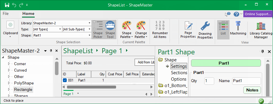
The Breadcrumbs Bar displays the name of the current drawing and is used to navigate your way around shapes and parts. This makes it much quicker to move in and out of shape editing and back to list view or straight to another shape part for editing.
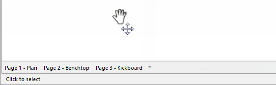
The Status Bar is displayed at the bottom of the ShapeMaster application window. It includes notifications that provides instructions on how to perform an operation or details of your current activity. These can be turned on/off using the right click menu. Above these are Page tabs.
You can move the scroll bar thumb to scroll the view to the left/right (shown below) or up/down. The scroll bars are on the right and bottom of the work area (or view).
This is a listing of all the items currently on the drawing. In this view, items which do not represent any physical items can also be added. This means that you can add pricing information, independent of any specific shape e.g. freight. For a more detailed discussion, see topic on List View.
Double-clicking a shape brings up the Shape Properties page allowing individual shapes to be formatted.
Property Sheets for Drawings, Shapes etc all have a title bar which provides the ability to drag floating dialog boxes to be dragged across PC monitor/s.
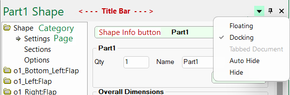
Shape dialog boxes can be viewed in Docking or Floating mode. If docked then shape details will be made available in a Quick Access Sidebar.
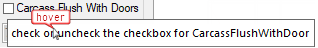
When you hover your mouse pointer over a button, selection, image etc, it provides more information about what happens with this option. Such as the 'Carcass' check box in the image below saying it turns the 'Flush With Doors' on and off.
You can move the page you are viewing, left/right or up/down, by holding down both right and left mouse buttons. See Mouse Shortcuts.